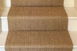
Find Samples
To add to your samples basket, simply navigate to a product you're interested in, select the colour you like and press the + icon on an empty sample slot.
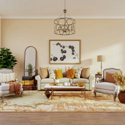
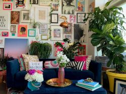
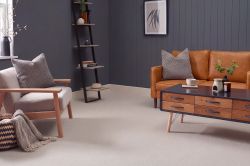
Who doesn’t love a colourful space? One that fills you with delight and child-like wonder at the beauty of different colours and shades – but why stick with colours that traditionally ‘go together’? Taking two colours that ‘clash’ and playing with them in your space can actually make an even more exciting and unique style that shows off your personality better than any traditional colour pairing.
Explore the different methods of colour clashing, as well as what colour clashing is defined as, before taking a look at the different ways in which you can add colour to your own home. We’ll also give some examples of some of our favourite colours to clash or mix for an explosion of wonderful colour in your home.
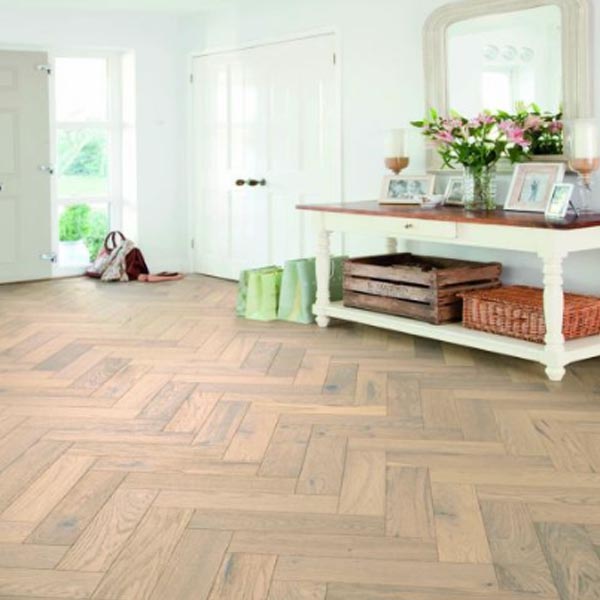
.jpg)
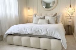
Colour clashing is the art of taking two colours that don’t traditionally pair or match and using them together in your interior design. Now this is purely subjective, but clashing colours typically tend to either be too close in hue, or too different to be considered ‘harmonious’ – for example, red and bright pink have classically been described as clashing colours, and these two shades sit very close together on the colour wheel. That’s not to say we love most of these colours matched together! It depends on the hue or shade.
So, for instance, as orange and green are on separate sides of the colour wheel, they’re often considered to clash because of the contrast in hue (that’s the pure pigment of a colour without any added white or black).
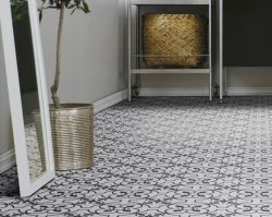
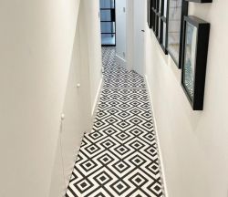
Colour clashing is deliberately taking two shades that aren’t usually put together and combining them in different ways – either using them together on your walls, or one on your floor and the other on your walls, or just using them in lots of ways throughout one space, from décor, to furnishings and even the window panes and door frames! So how can you clash colours together in a way that is artful and pleasing to the eye?
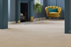
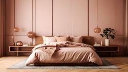
Balance is key to mastering colour clashing in interior spaces – after all, too much or too little won’t strike the right harmony needed to make it look stylish! To hit the right note every time, you need to ensure that when you pick contrasting colours, that you’re picking shades of the same tone and intensity. For example, purple and yellow don’t traditionally go well together, but a muted mustard tone with a deep lavender colour will look playful and carefully curated.
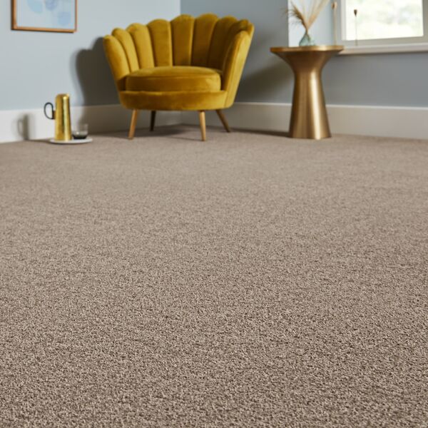
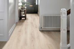
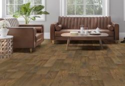
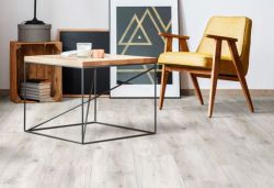
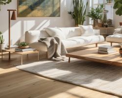
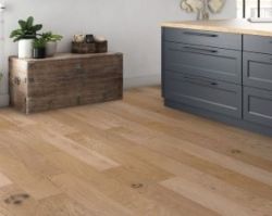
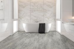
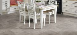
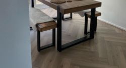
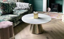
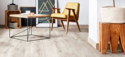
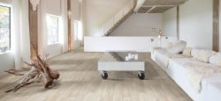
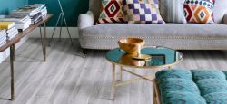
The scale of your colour clashing can also have an impact on how well it hits home – for example, using too much of one colour will drown out the other shade, while covering your entire room head to toe in just the two clashing shades will also be too intense. A good way to work around this is by using one colour for your flooring and the other for touches of your décor. Alternatively, keeping the base of your room, the flooring and the walls, in neutral tones means that you can use strong contrasting colours in your furniture and décor without overwhelming the room.
.jpg)
There are a few colour pairings out there that have traditionally been avoided by interior designers and influencers, but in today’s world where maximalist style and making a bold statement with your home décor are favoured, there are some colour clashing schemes that we love to see working together.
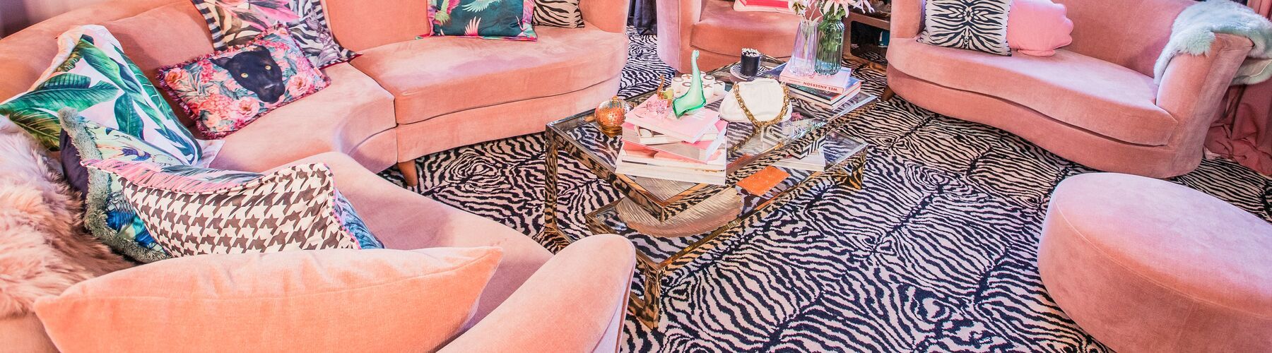
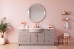
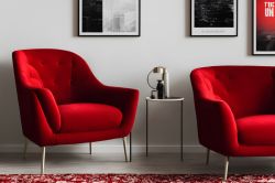
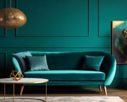
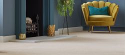
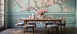
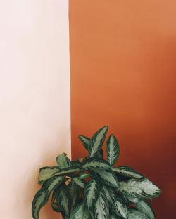
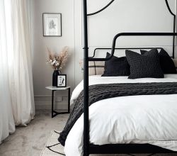
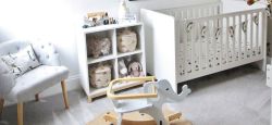
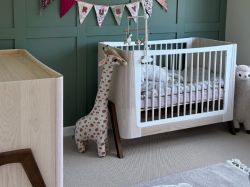
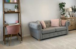
While they appear together very harmoniously in nature, pink and green sit opposite each other on the colour wheel. As both can be vibrant and eye catching, they can create a burst of colour in a room that may otherwise get overlooked, like a dining room or study. Blacks and whites can help to break up the look from looking too overwhelming, but we think one of the best ways to try this colour clash is to use a forest green paint or wallpaper on your walls with a light pink carpet and bright pink décor - it's the perfect nod towards the colourful décor of the 1970s.
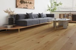
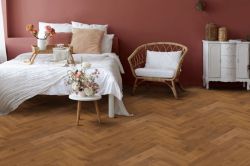
Orange and pink are a colour combo that you’ll have seen in a beautiful Indian sari, or the vibrant décor of Morocco or Mexico. It’s becoming more common in Western fashion, and it’s one that looks great in large interior spaces too! Try combining a pale pink with a soft orange to create a very pretty feminine space, with plenty of cream and white accents to make the space look elegant. Alternatively, amp up the hue of the shades for a vibrant tangerine orange with hot pink details – and use wood effect laminate and white walls as a plain backdrop to really let the colours pop without overwhelming the space.

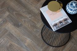
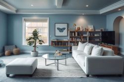
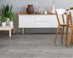
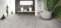
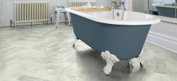
Combining different tones of the same colour might seem like more of a traditional colour palette, but the trick is to keep the undertones the same – if you pick a cooler blue, keep all the different blue and green shades in the same undertone, but mix it up with different textures to create a monochrome look that dances to a different beat! A grey-blue stone effect LVT can make for a great base along with a blue paint for your walls to pair with a turquoise or Greek blue bathroom – you can find out more about which flooring is better suited in our best flooring for bathrooms guide.
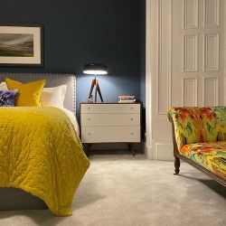
Lemon yellow works beautifully with a bright blue, especially when used in subtle places like your cushions, curtains, or décor elements. It also works really when you pair a mustard yellow with a deep navy for a more mature look – you can still add a little sunshine to a darker space with these colours! Light yellow and dusty blue also add a coastal charm to your living spaces, especially when paired with white, beige and touches of green from plenty of plant life.
Fancy chatting to some of our experienced floorologists about which flooring you think would work best with your favourite colour clashing lookbooks? You just need to pop down to your local Tapi store and we’ll always be right here to help! You can even book a free home visit for us to come to you, so we can help you assess what colours and types of flooring will work best in the spaces you want to add a little Tapi magic to.

Published: 16-02-2023


-250.jpg)
-250.jpg)
 copy-250.jpg)
-250.jpg)
-250.jpg)
-250.jpg)
 - Article Image (not header)-250.jpg)
-250.jpg)
-250.jpg)


-250.jpg)

-250.jpg)
-250.jpg)
-250.jpg)
 (2)-250.jpg)
 (2)-250.jpg)
-250.jpg)
-250.jpg)
-250.jpg)
-250.jpg)
-250.jpg)
-250.jpg)
-250.jpg)
-250.jpg)
-250.jpg)
-250.jpg)
-250.jpg)
-250.jpg)
-250.jpg)
-250.jpg)


-250.jpg)


 (1)-250.jpg)
-250.jpg)
-250.jpg)
-250.jpg)
-250.jpg)
-250.jpg)
Hold tight! We're getting your results

Did you know...
You can book a FREE home visit?